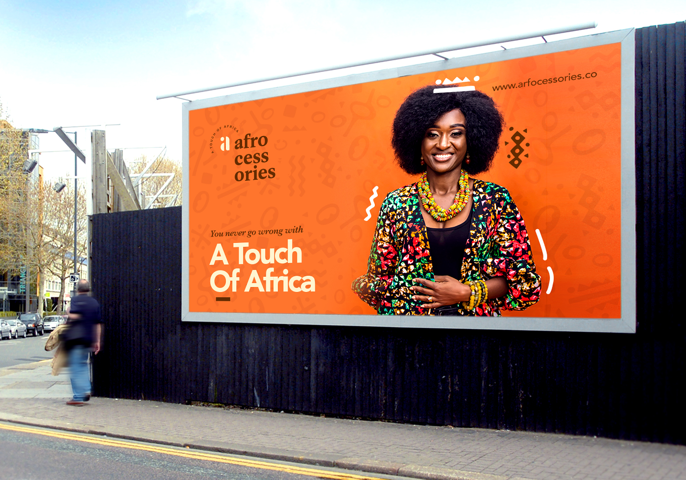
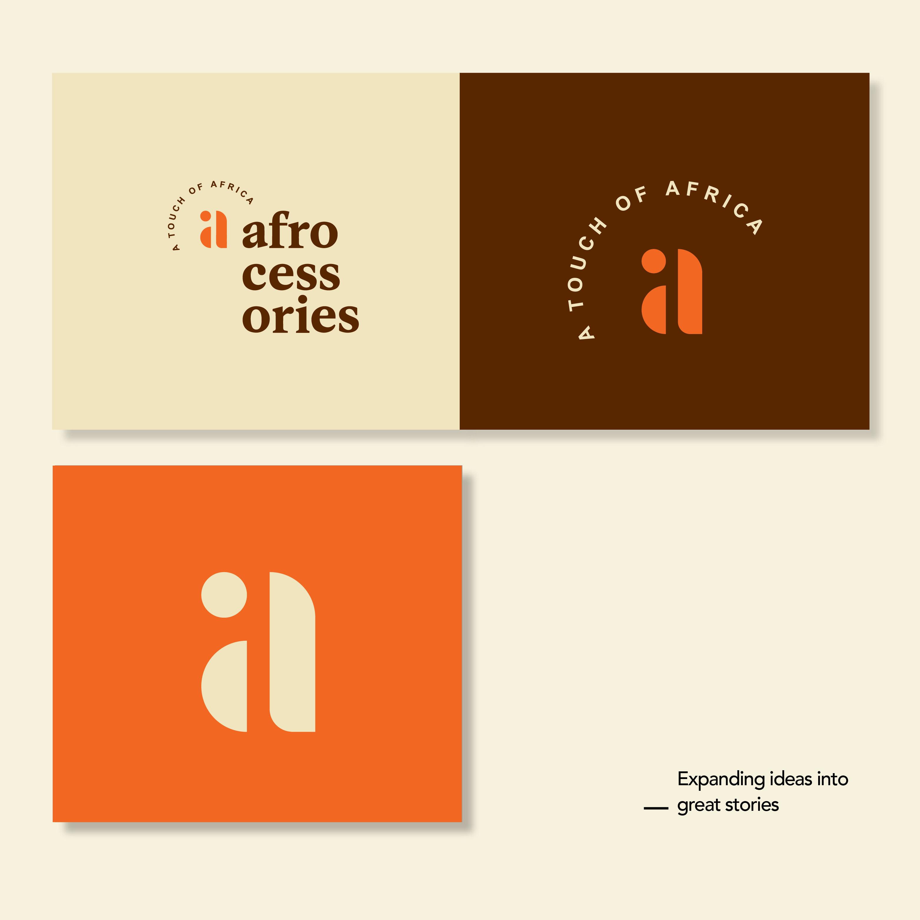
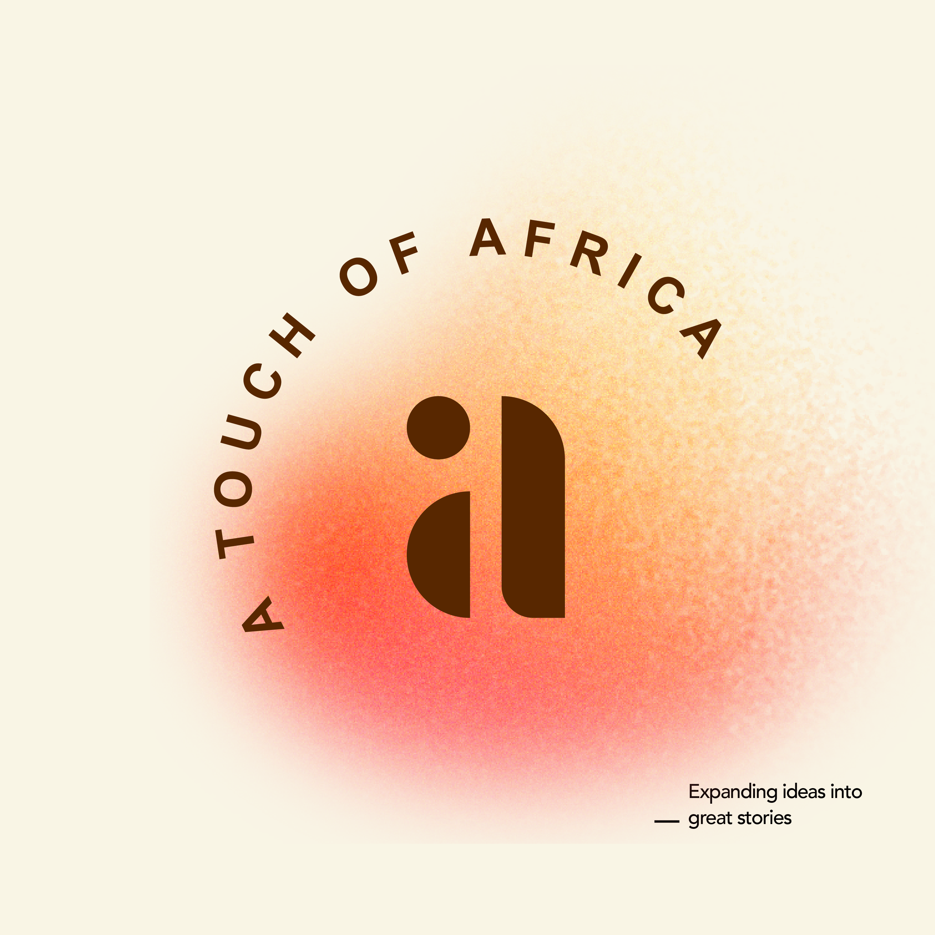
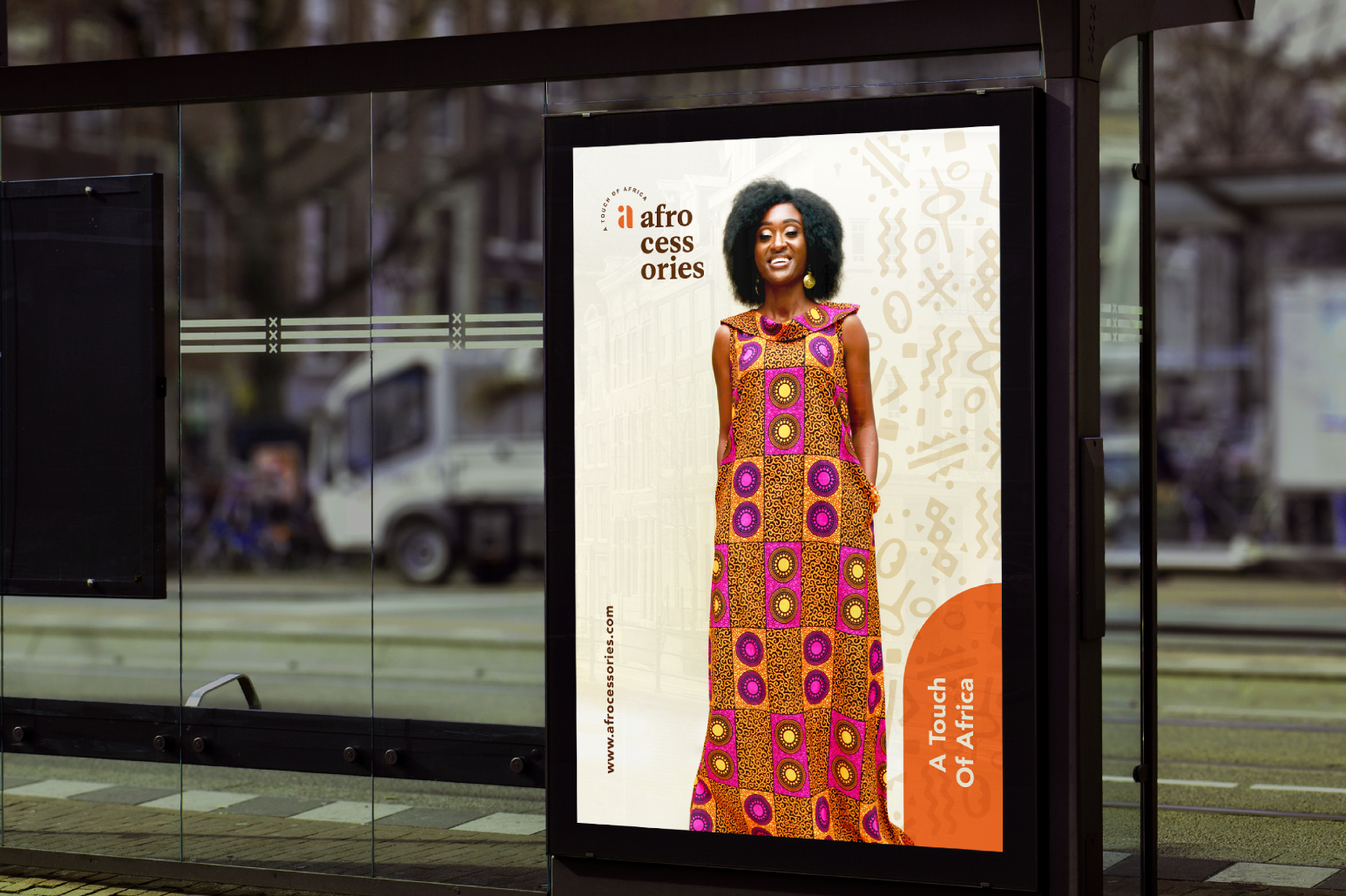
In order to achieve a distinctive solution to the Afrocessories identity, we had to sort out for a simplistic yet reductive execution of the logo concept after a holistic study of the business looking at both the current and future journey.
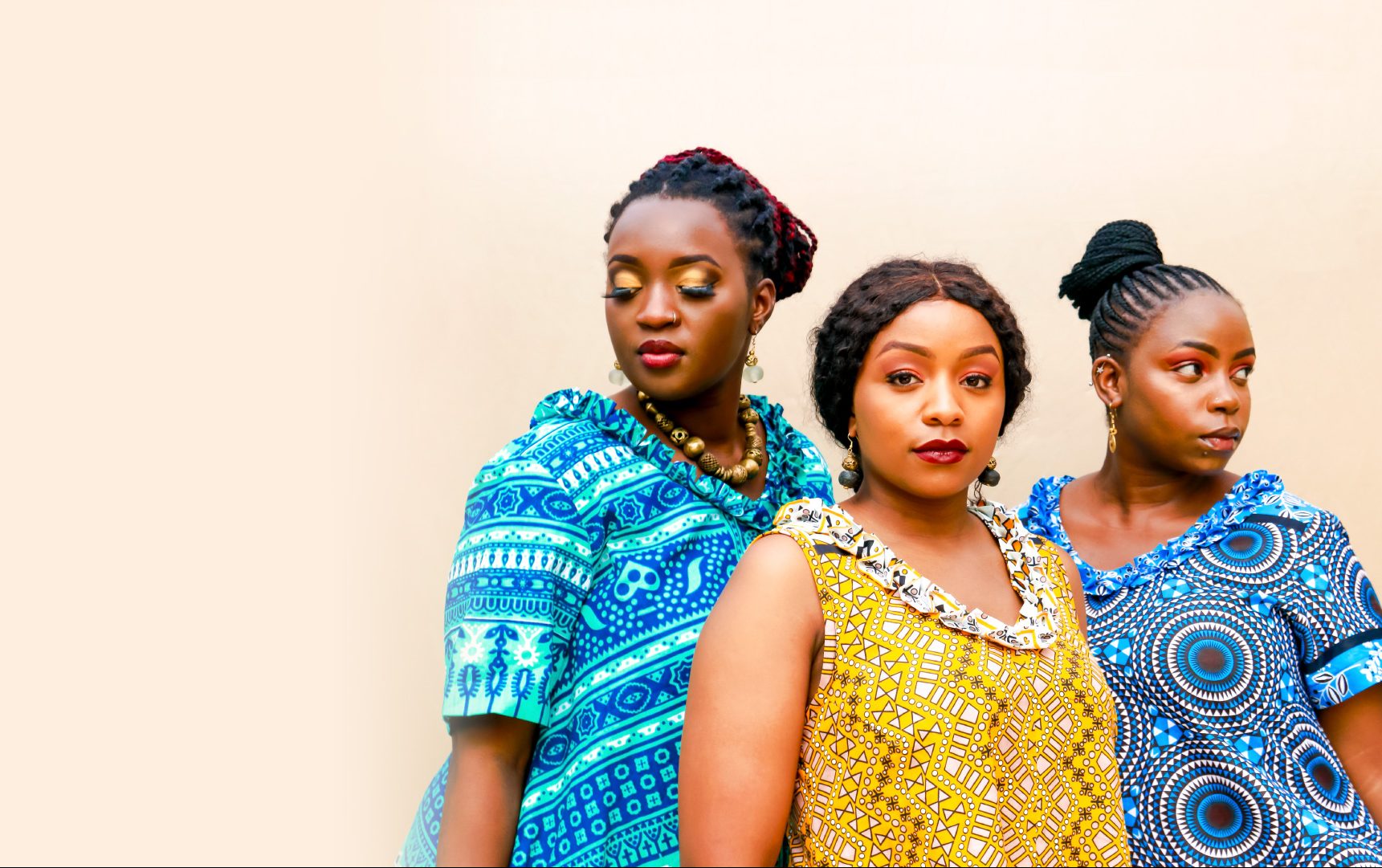
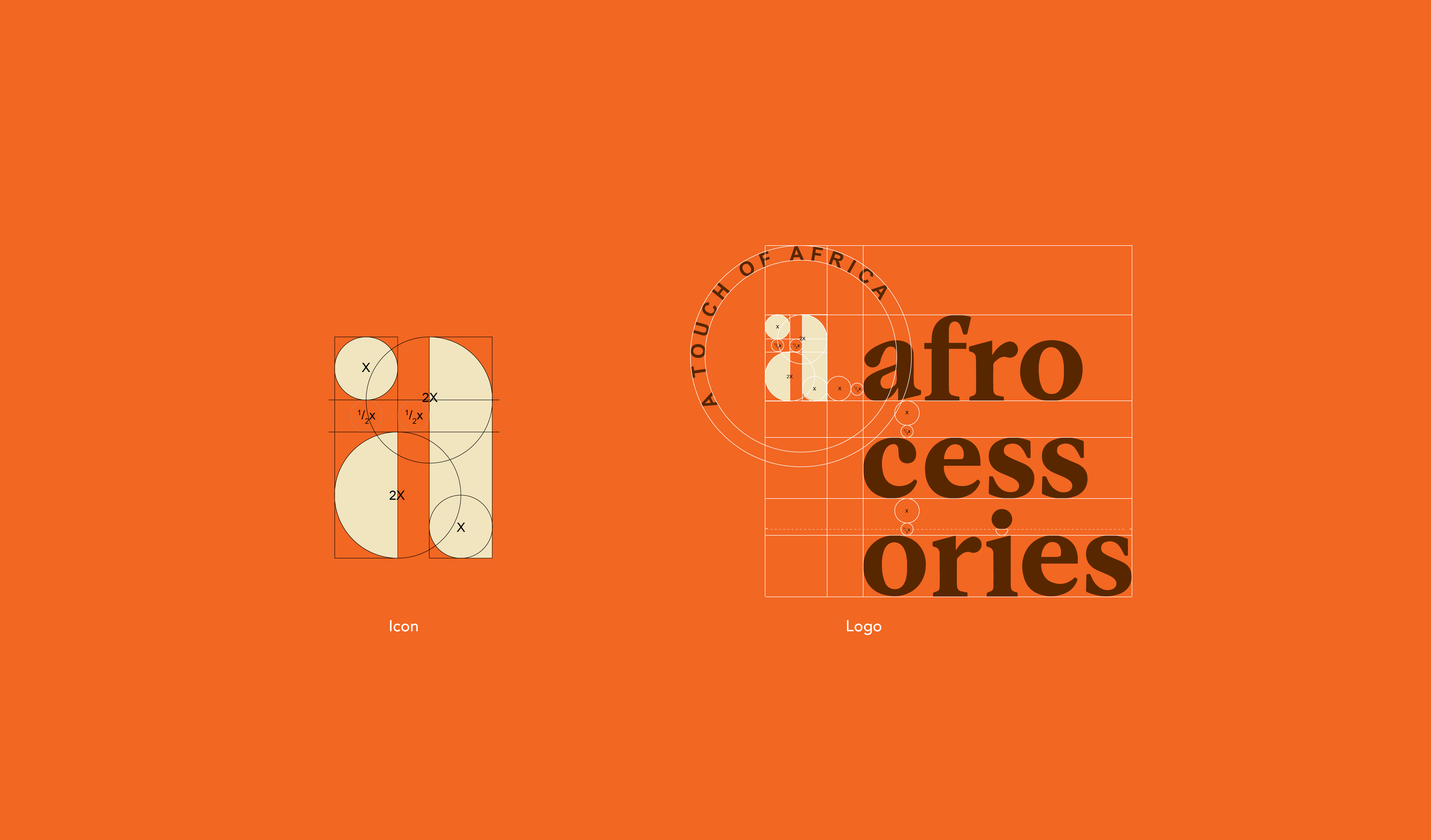
The idea has been birthed from patterns and shapes which have always been recurrent mode of display in clothing industry. With quite a minimalistic approach the logo icon illustrated is crafted by circular shapes which represents wholeness and completion which is part of the core goal of the business. To even create a more functional foundation to the identity, the icon emotes a feel of a button and the initial letter of the business name as-well as a representation of the initial of Africa.